
Logo & mark
The 2026 mark is one locked unit: a black gabled house with a four-pane window, “THE” in black, “HOME TEAM” in brand red, and “PROPERTIES” in black beneath a divider rule. House and wordmark are never separated, recolored, stretched, or rebuilt.
Keep a margin equal to the height of the roof on all four sides — nothing crowds the mark.
Horizontal is primary; the stacked version fits square or tight spaces. Keep the horizontal lockup at least ~140px wide so “PROPERTIES” stays legible.
A bright red on a clean neutral base
Each swatch below shows its name, hex value, and where to use it. Red carries action and a few brand moments; a calm slate handles the quieter structural touches. The brand red comes in two shades — one for buttons and one for text and links — explained just below.
Every color pairing here is tested to meet WCAG 2.1 AA contrast for legibility.
Two families, a confident scale
Plus Jakarta Sans gives headlines a friendly, distinctly-not-corporate voice; Inter keeps body and UI calm and clear. Two families only — uppercase is reserved for small eyebrows and labels.
The scale
Specs shown as mobile / desktop (≥768px). One H1 per page. Sentence- or Title-case headings; all-caps for small eyebrows only.
Buttons & links
Built for conversion and accessibility: big tap targets, clear labels, a visible focus outline, and the two reds so text stays legible on any surface. Every state is shown below.
Primary — brand-red fill
The brand-red button with white text. Big tap target, clear label.
Secondary — slate outline
A slate-outlined button — clearly the secondary action, distinct from the red primary by color and fill.
Text link · always underlined
Curious what your home is worth? Get your home’s value
On hover the link darkens to a deeper red and always stays underlined.
Tags & badges
Small, uppercase, pill-shaped tags carry status and metadata, plus filter chips that clearly show which one is selected. SOLD may use the brighter brand-red fill; everything else stays restrained.
Dark ink for the authoritative “For Sale,” a calm slate accent for “New Construction,” and the brighter brand red reserved for the celebratory “SOLD.”
Neutral chips for metadata; the dark disclosure variant carries quiet status notes over photos.
Tappable and easy to hit. The selected chip fills with dark ink so the choice is clear by shape and color together.
45+ years, 1,100+ families. The red-tint wash with ink text is a quiet brand moment — perfect for trust markers and inline asides. Dark text only on the tint.
Homes by The Home Team
A clean, filterable view of what’s on the market and what’s recently sold — the heart of the site.
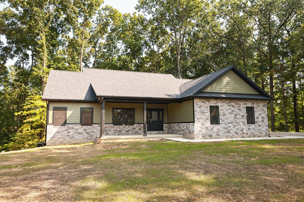
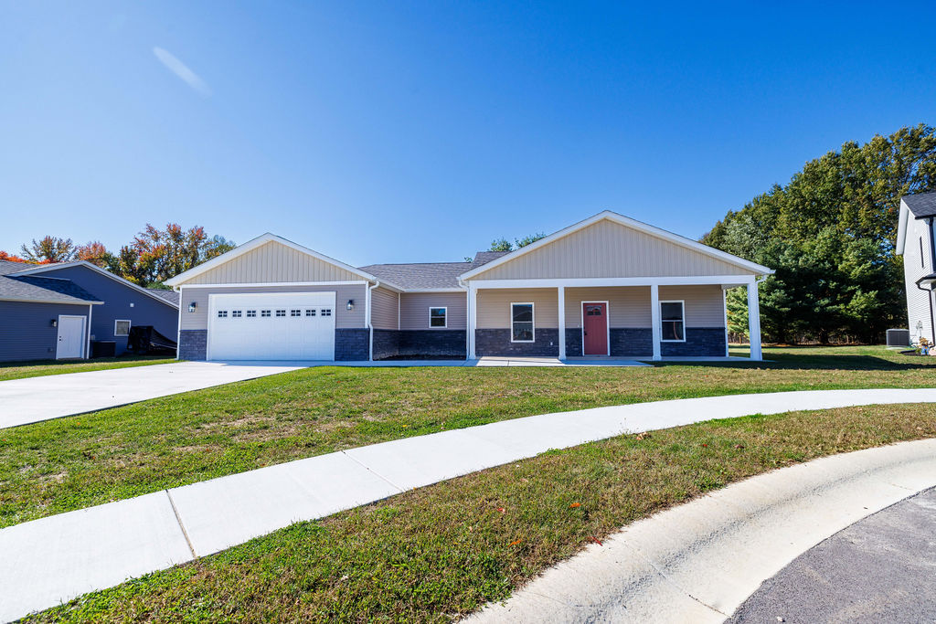

Sold examples shown are placeholders — real recent sales and photos drop in here.
Photography & art direction
Real photography only: bright, natural light, warm and true-to-life, minimal filtering. Locked ratios keep galleries tidy; a bottom-weighted ink scrim keeps white text legible over any image.
16:9 · Hero4:3 · Listing
Sell with the home team
White text always sits in the darkened lower third of the image, where it stays easy to read.
Team & agents
Sam and Rob are the faces of the business, helping families across Owen, Monroe, and surrounding Southern Indiana counties. Each agent’s cut-out leans on the outer edge of its own card — on these cards, Sam sits left, Rob right — with name, role, bio, and contact filling the rest.

In real estate since 2004, Samantha is a trusted guide for local buyers and sellers. Outside the office she’s all about her kids, the gym, and a good book — and she’ll send you to Upland for lunch.

Licensed since 2002, Rob brings deep local market knowledge to every deal. Off the clock you’ll find him hiking, at the gym, or out on his Harley — usually with a stop at Big Woods.
Together, Sam and Rob bring 45+ years combined and have helped 1,100+ families — backed by a behind-the-scenes HOME TEAM family. Both are titled REALTOR®.
Plainspoken, local, expert — never corporate
Short, declarative, benefit-led. We speak as “we / our team” and address “you.” Local place names appear naturally where they build trust. No hype, no jargon, no emoji.
Write the brand name as “HOME TEAM” (caps) in running copy.
“45+ years and 1,100+ families helped across Owen, Monroe & surrounding Southern Indiana.”
Concrete proof, local, plainspoken. Real numbers do the talking.
“Thinking of selling? Start with a clear, no-pressure home valuation.”
Benefit-led and low-pressure; invites the next step without pushing.
The system, in the wild
The tokens above, assembled into the three patterns reviewers most want to see: a big-number stat band, a testimonial, and a CTA banner.
“If you’re looking for a realtor, I would highly recommend Home Team Properties. Rob and Samantha were reliable and knowledgeable in helping with the sale of a family property. It was a stress-free experience from beginning to end.”
Connie Kay · Google review
Find out what your home is worth.
A quick, no-pressure valuation from the team that knows Owen, Monroe & Southern Indiana best.